
Interaction Design Documentation
Design documentation is a well-known staple within the user experience industry. It has ultimately been a tool to help solve problems and facilitate communication among a team about the design process of a prokect. However, a major piece of the puzzle that has been missing in order to help illustrate to the product team the nuance and usability of a product.
I believe that piece to be interaction (and specifically animation-based interaction). In my mobile redesign of my desktop / web application, Critic, I decided to also take the opportunity to imagine what an interaction design portion of UX documentation may look like. I used Framer X’s prototyping capabilities alongside React JS to bring this idea to fruition. Here are my explorations. Have an opportunity to interact with the prototype at the bottom.
React Interactions
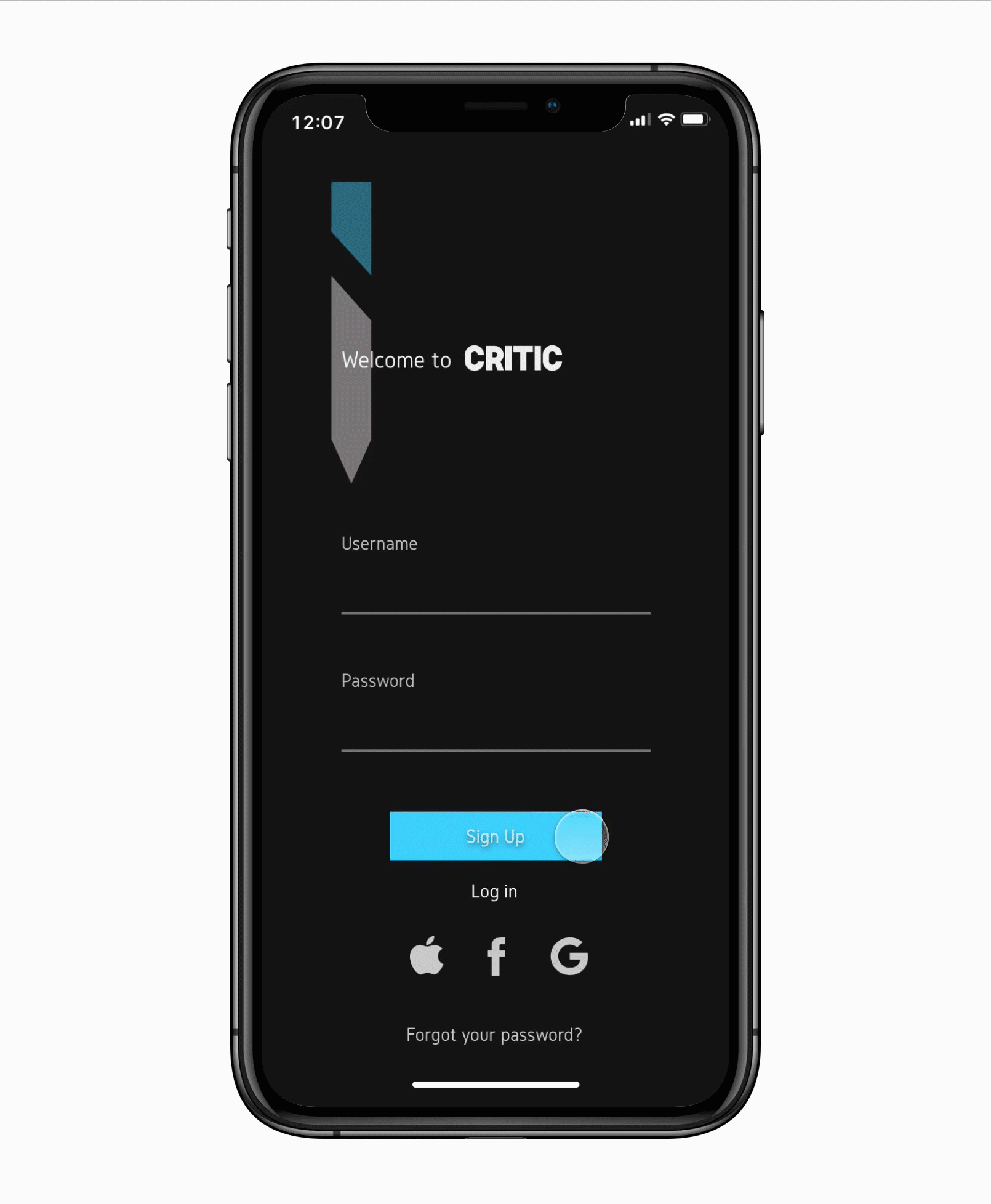
Staggering Login Animation
import { Override } from "framer"

	const variants = {
			hide: {
					y: 50,
					//x: -50,
					opacity: 0,
			},
			show: {
					y: 0,
					//x: 0,
					opacity: 1,
					transition: {
							staggerChildren: 0.1,
							delayChildren: 0.3,
							ease: "easeInOut",
							duration: 0.6,
					},
			},
	}

	const childrenVariants = {
			hide: { opacity: 0 },
			show: { opacity: 1 },
	}

	export function Parent(): Override {
			return {
					initial: "hide",
					animate: "show",
					variants: variants,
			}
	}

	export function Children(): Override {
			return {
					variants: variants,
			}
	}
Notes
Having this staggering animation is one of the more subtle animations / interactions featured amongst the six present. However, it was important that this animation welcomes the user. It informs them of the tone of user interface — one that is sleek, modern, and dynamic. Having an animation that staggers up from the bottom gives it a welcoming feel rather than just abruptly being presented with information once opening the app. It also gives the login page also an added level of visual interest which intrigues the user and gets them excited to use the app and see what other visually interesting animations and user interfaces are in store.
Dual-State Button
import { Override } from "framer"

const variants = {
    initial: { background: "#47D8FF" },
    tapped: { background: "#171616" },
}

export function Button(): Override {
    return {
        initial: "initial",
        whileTap: "tapped",
        variants: variants,
    }
}
Notes
The purpose of this dual-state button is simple — it’s all about feedback. The reason why this button is important to the design because it’s indicating to the user in some of their very first interactions with the application that it is responsive to their actions, even if it’s in a subtle way. Having the button change state not only in a way visually initiates the processing of their name and email but, it also acts as a confirmation to the user that their information is indeed being processed and they’re being led to the homepage.
Auto-scroll

import { Override, useAnimation } from "framer"

// Declare the controls variable so we can access it from both functions
let controls

// Apply this override to your scroll component
export function Scroll(): Override {
    controls = useAnimation()
    return { scrollAnimate: controls }
}

// Apply this override to your button
export function goToGames(): Override {
    return {
        onTap: () => controls.start({ y: -755 }),
    }
}

export function goToFilm(): Override {
    return {
        onTap: () => controls.start({ y: -100 }),
    }
}

export function goToMusic(): Override {
    return {
        onTap: () => controls.start({ y: -1390 }),
    }
}
Notes
Critic’s home page is obviously not like most in the sense that it is very dense. This was intentional because Critic already has many pages. We want the user to be able to access the most amount of information that is useful to them without having to leave home. They have enough information elsewhere and need a central hub of all the top-level navigation. However, having three types of media can be overwhelming. For users who want to be able to quickly access the forms of media they want without having to always scroll to that place there is auto-scroll. It reduces friction and makes for a more efficient user experience.
Framer X Interactions
Vertical and Horizontal Scrolling

Notes
Scrolling and having content that is off the screen but still accessible is integral to this design. Having horizontal scrolling allows for users to access more information on one page than otherwwise accessible, as well as makes more room to view posters. Also, vertical scrolling allows for multiple forms of media to be accessed on one page.
Menu

Notes
Critic has five pages, which is quite a lot for a mobile app. Usually you will find applications have three, if not four distinct pages. However, Critic is for the power user looking for many features in the field of media criticism. Having a conventional menu layout where all the pages are highlighted on the bottom of the screen would have been cluttered, overwhelming, and ultimately would’ve made each icon too small. It made much more sense for the user to be able to have a fixed menu in the bottom left corner of the screen to house each distinct page.
Screen real estate was also important in this decision. Because there are so many pages it is important for the user to be able to see and know what page they’re on at all times. Instead of sacrificing screen real estate having a fixed title at the top, having a small yet simpler graphical representation on the bottom of the screen to indicate the user’s page made a lot more sense for our user.
Pagination

Notes
Framer X’s pagination feature was used here to allow the user to see more information about each piece of media, film in this case, than the homepage. The reason why this pagination carousel was used was because it allowed for each piece of media to occupy most of the space on the screen whilst still indicating to the user that they can continue to scroll to see more.
Live Critic Preview
Try out the interactions for yourself! Tap log in to start.